Google Logo Updated Again – Seen Across Android And Web
Google has recently changed their logo and now it look a lot better than the old one. This happened a few weeks after the company announced a huge restructuring effort that will split the search, advertising and internet giant into several different organizations, the new Google is showing off a new identity.
Google Logo – Animated – Transformation
The iconic four colors and “Google” over a white background remains unchanged, but the font is significantly different, removing the serifs that have been part of the letters for years. The new logo is flatter, slightly more modern design, and is closer to its parent company, Alphabet’s logo.

Today we are introducing a new logo and identity family that reflects this reality and shows you when the Google magic is working for you, even on the tiniest screens. As you’ll see, we’ve taken the Google logo and branding, which were originally built for a single desktop browser page, and updated them for a world of seamless computing across an endless number of devices and different kinds of inputs (such as tap, type and talk).
Google Logo – Animated – Different Types
Google designers Alex Cook, Jonathan Jarvis, and Jonathan Lee spoke up today in the Google Design blog on what it took to create a new brand identity for the company.
Google is not a conventional company,
our mission – to take the world’s information and make it universally accessible and useful – continues to evolve.
A refinement of what makes us Googley, combining the best of the brand our users know and love with thoughtful consideration for how their needs are changing.
In the Google Blog, Tamar Yehoshua, VP, Product Management & Bobby Nath, Director of User Experience suggested that this set of branding bits has been updated “for a world of seamless computing across an endless number of devices and different kinds of inputs (such as tap, type, and talk)”.
Google Logo – Flow
Beyond the new wordmark, Google is also doing away with the somewhat iconic blue and white “G” logo and replacing it with a new, four-color version to match the four colors the company is so closely associated. The four colors will also be used in the “microphone” that shows up in the many places where Google’s voice search is enabled. There is a lot of updating to be done before this branding is seen across the many places where you can interact with Google, of course, but this new branding will likely spread everywhere before long.
Google – “G” Logo & “Mic” Logo
For design enthusiasts, who want to dig deep into the process behind how Google created its new logo, the company has posted extensive details on its design blog.
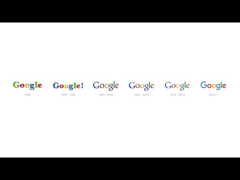
In a YouTube video introducing the new logo, Google starts with a tour of its previous designs; this is hardly the first big change Google has made, but this is undoubtedly one of the biggest in years. Google has been flattening out the logo for a long time, but the font persisted. Now, it is truly a new era.
This new logo and mark will be spreading out and popping up on a wide variety of Google products over the next few days. Expect this branding to appear on all of your Google products by the end of the month, without a doubt!
Source: Google Blog