Apple Removes An Annoying Thing About CarPlay In iOS 10.3 Beta
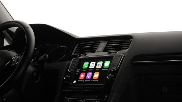
CarPlay is Apple’s way of extending iOS to your car. It is available in countless new models from a variety of car manufacturers as well as third-party head units. When Apple designed CarPlay for iOS, it decided to use a look and feel that is like iOS. For example, there is a home button that takes you to a simple home screen of icons.
However, this interface is proved to be not idle for cars, as it causes drivers to spend more time than ideal to switch between apps. Studies shows that while driving, people focus on two main things you have on a car dashboard. First one is a map and the second to control your music. Currently, in order to switch between those tasks, you have to tap twice: once for home, and then again for the other app. While this not a huge hassle, it still takes some extra time looking away from the road. The CarPlay interface was meant to be simple because drivers should not really be made to take their eyes off the road to figure out what they are doing on the system.
This annoyance has existed for a long time in CarPlay for iOS, but fortunately Apple decided to fix it. In the latest public beta of iOS 10.3, Apple has modified the interface. Now, instead of a single icon in the upper left-hand corner, there are three. They list your recent apps, giving you a much better way to switch between them. It is also easier and faster.
While it is not a huge change, it is a welcome one. And it is also a sign that Apple is thinking a little more clearly about making interfaces native to their situations. Hopefully, those not running the beta can get their hands on the latest CarPlay in the next couple of weeks.